

Unexpected Color Combos That Actually Work for Sophisticated Events

Because beige and blush need a break
If you scroll through enough event inspiration, it can start to feel like every palette lives in the same neighborhood. Beige, blush, ivory, champagne. Beautiful, yes. Memorable? Not always.
At Big Time Creatives, we love helping clients move beyond the expected while still keeping their events polished, intentional, and brand aligned. Bold color does not have to mean chaotic. When paired thoughtfully, unexpected color combinations can create sophisticated, photogenic environments that feel fresh, elevated, and completely custom.
Whether you are planning a corporate event, nonprofit gala, wedding, or brand activation, these unexpected event color palettes are some of our favorites for 2025 and 2026.
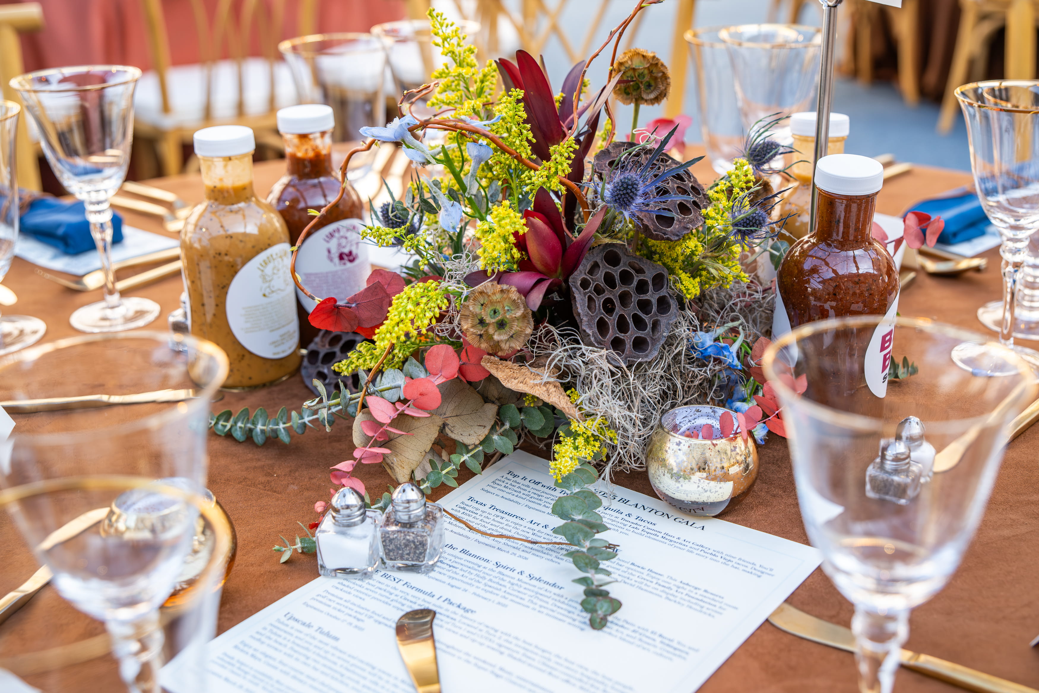
Burgundy + Blush + Burnt Orange
The look: Moody romance meets desert sunset
The vibe: Gala dinner in a Moroccan courtyard… except it is happening in a downtown loft
This trio blends warmth and depth in a way that feels rich, layered, and sophisticated. Burgundy anchors the palette with drama, blush softens the overall feel, and burnt orange adds a warm glow that keeps the design interesting.
The key is texture. Velvet linens, brass accents, and candlelight bring the palette into a luxe territory instead of making it feel seasonal.
Big Time Twist: We have used this palette to design fabric draped stages, candlelit dinner tables, and lounge spaces for corporate clients who want serious elegance with just a hint of playfulness. It is also one of those palettes that photographs beautifully in warm lighting and at golden hour.
Chartreuse + Charcoal + Soft Lilac
The look: Edgy meets ethereal
The vibe: If an art gallery hosted a garden party
Chartreuse is the wild card here, but when paired with charcoal and soft lilac it suddenly feels chic and intentional. Charcoal grounds the palette, lilac brings a soft romantic quality, and chartreuse delivers the unexpected pop that makes the design memorable.
This combination works beautifully for creative brands, fashion focused events, or corporate gatherings that want to feel modern and artistic.
Use it smart: Instead of covering the entire room in chartreuse, introduce it through florals, statement signage, specialty cocktails, or a bold design moment like a bar backdrop or stage installation.
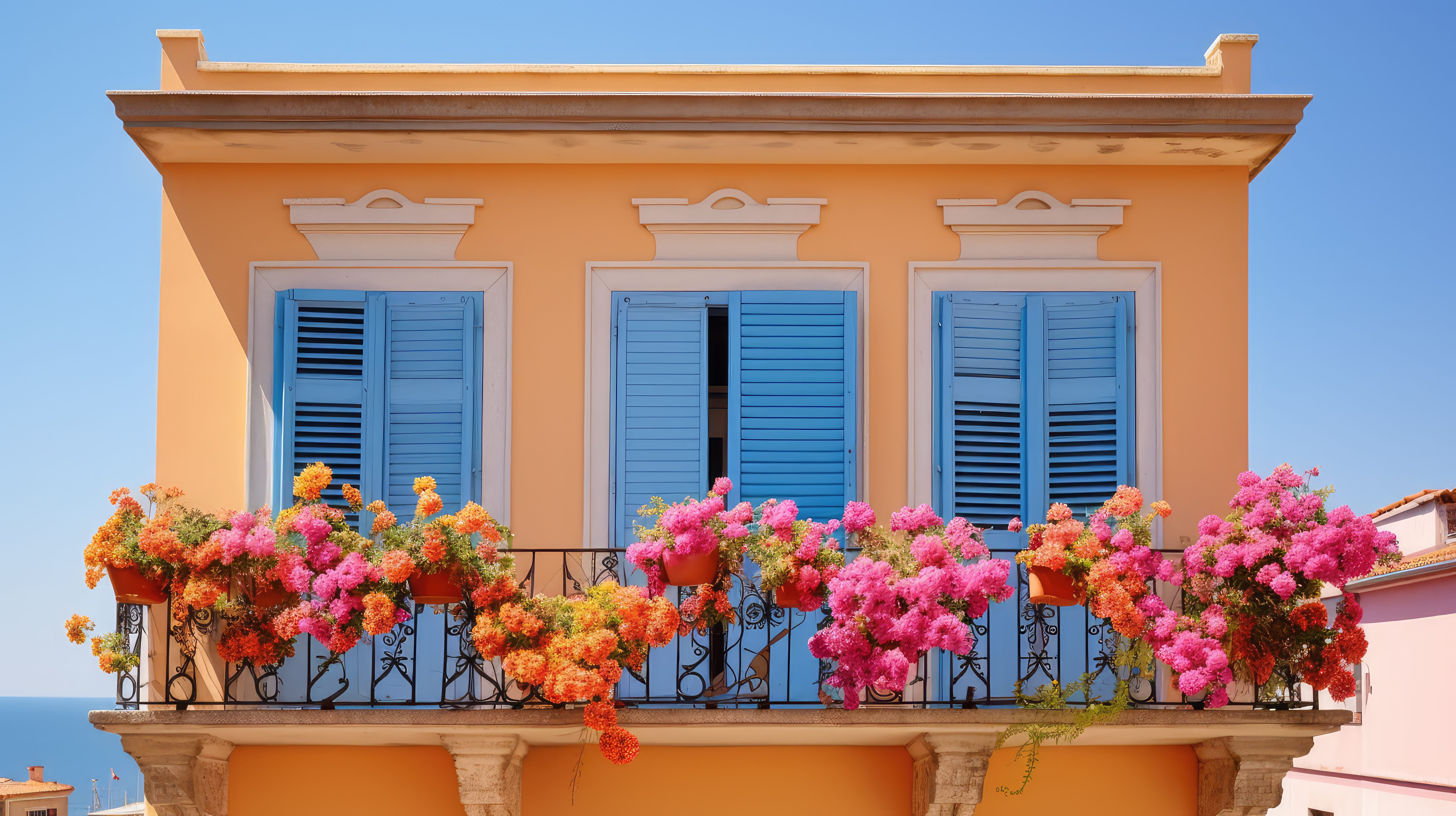
Terracotta + Sky Blue + Marigold
The look: Modern Tuscany
The vibe: Wine country… but with strong WiFi and a drone camera
This palette balances earthy warmth with bright, cheerful contrast. Terracotta provides structure and grounding, sky blue keeps the palette light and airy, and marigold adds a dose of sunshine.
It is a fantastic option for outdoor celebrations, vineyard style events, or spaces that benefit from natural textures and warm lighting.
Big Time Touch: We have used this palette for vineyard inspired ceremony setups, scenic statement walls, and relaxed lounge areas layered with wood, linen, and ceramics. It feels worldly and elevated without being overly themed.
Navy + Mustard + Dusty Rose
The look: Sharp meets soft
The vibe: Museum gala with a touch of retro romance
Navy and mustard create a strong, tailored base while dusty rose softens the palette and adds warmth. The result feels balanced, polished, and slightly unexpected.
This combination works particularly well in venues with strong architecture such as museums, historic buildings, or modern galleries.
Pro move: Use navy for major elements like draping or linens, mustard through accent furniture or lighting, and dusty rose in florals and tabletop design. The contrast keeps the palette interesting while still feeling cohesive and upscale.
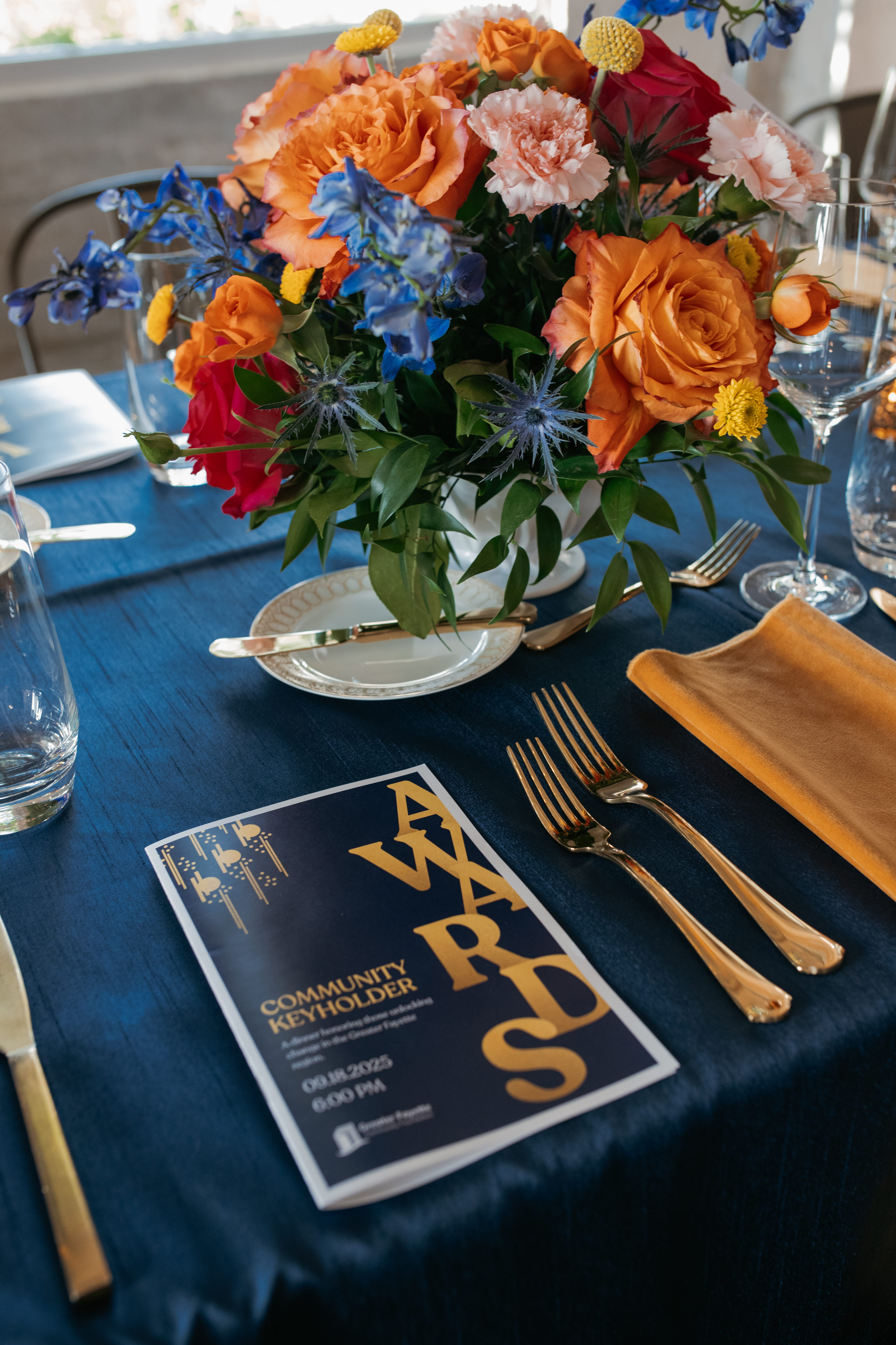
Why Unexpected Event Color Palettes Work
Color is one of the most powerful tools in event design. When guests walk into a space and immediately feel the atmosphere, color is usually doing a lot of the work behind the scenes.
Thoughtfully layered color can:
• Reinforce the story of your event
• Guide guest flow throughout the space
• Highlight focal points like stages, lounges, and installations
• Elevate your brand presence without overpowering the room
• Create spaces that photograph beautifully for marketing and social media
Unexpected palettes work especially well because they feel intentional and fresh. They signal that the event was designed, not just decorated.
Ready to Play With Color
If you are planning a gala, corporate event, nonprofit fundraiser, or luxury wedding, your color palette is one of the most impactful design decisions you will make.
At Big Time Creatives, we help clients create immersive environments that feel stylish, thoughtful, and completely unique to their event. From mood boards and design concepts to full scale event production, we build color palettes that elevate the entire guest experience.
If you are ready to move beyond the safe neutrals and explore something bold but sophisticated, we would love to help design it with you.


